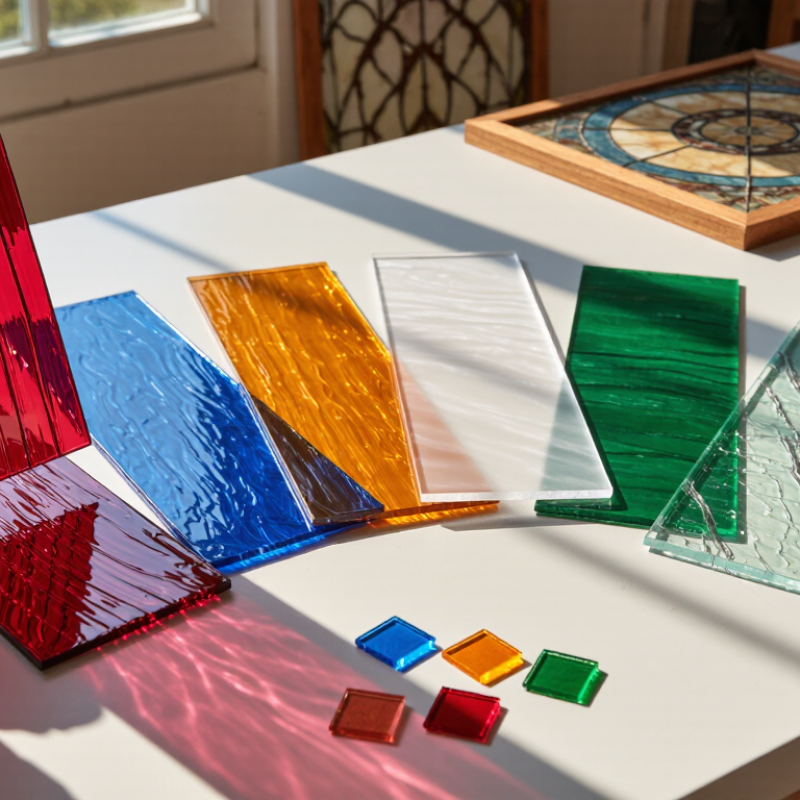
Choosing Spectrum Stained Glass Sheets is less about finding the brightest color and more about matching glass to the finished panel. A ruby sheet can look deep on a workbench, then glow differently when afternoon light passes through it. Texture, thickness, opacity, and color variation all affect the result. Small samples help. They also reveal flaws that product photos can hide.
Professional references offer useful context, but not a single answer. The National Glass Association’s technical resources discuss glass selection and performance, while the U.S. Department of Energy’s daylighting guidance explains how natural light changes the feel of interior spaces. These sources support a practical point: consider where the panel will sit, how much light it receives, and whether privacy matters. A sunny kitchen window and a shaded cabinet door need different choices. Check sheet dimensions, surface texture, and compatibility with your cutting and assembly method before ordering.
Color is personal. The trade-offs are not. A heavily textured sheet may scatter light beautifully but make detailed cuts harder to judge. A smoother piece can show crisp outlines, yet feel less lively in a broad panel. I would compare samples against the actual frame and background, then view them in morning and evening light. Even careful testing cannot predict every finished effect. That uncertainty is worth acknowledging. A measured choice usually beats relying on a screen image alone.
Identify the exact product line before choosing a sheet. Read the full series name, item code, and compatibility note on its label or supplier specification. Color and surface texture are useful clues, but they cannot confirm a glass formulation. A pale blue sheet may look identical across two lines and behave differently in a kiln. A color card is not enough. Record the item code and batch number, then check that information against the current technical sheet. It is easy to trust a familiar color; that shortcut can fail.
Confirm that the sheet is rated for COE 96, not merely described as “compatible.” Under the common studio convention, COE 96 represents a nominal expansion of about 9.6 × 10⁻⁶ per degree Celsius. A difference of 10 COE points equals roughly 1.0 × 10⁻⁶ per degree Celsius. That may sound small, but mismatched expansion can leave stress inside a fused piece. ASTM International’s ASTM C372-94(2020), Standard Test Method for Linear Thermal Expansion of Glass, describes a method for measuring this property. Use supplier data for the exact sheet, and avoid mixing lines based only on appearance. When documentation is missing, pause and verify it; a test tile may help, but it does not replace confirmed compatibility. I still leave room for doubt here. Labels can be misread.
When choosing stained glass sheets, check thickness before planning cuts or selecting a channel. Around 3 mm is common, but “about” matters. ASTM C1036-21, an industry specification for flat glass, includes a nominal 3 mm thickness category; it does not mean every sheet measures exactly 3 mm. Textured surfaces and handmade variations can affect readings. Small differences matter.
Use a caliper gently at several points along the edge, avoiding pressure that could chip the glass. Record the largest and smallest readings. A sheet measuring near 3 mm may still feel different when fitted into a narrow came or copper-foil project. Test a small offcut first. It is a little extra work. Check length and width too, especially if your pattern has tight borders; usable dimensions may shrink after trimming uneven edges. I have found that measuring only one corner can be misleading, particularly with rippled glass. Leave a modest allowance for cutting loss, and confirm the sheet lies flat before marking your pattern.
A sheet that looks vivid on a worktable may appear muted once sunlight passes through it. Before choosing colors, observe the project’s actual light: note the time of day, window direction, and nearby shadows. North-facing rooms often receive cooler, steadier light, while direct afternoon sun can make warm colors glow intensely. Hold samples near the installation point. Test them at different times.
Opacity changes both brightness and privacy. Clear glass keeps colors luminous and lets shapes remain visible; opalescent or denser sheets soften outlines and reduce glare. For a window beside a busy walkway, a milky texture may provide useful screening. In a dim hallway, however, several opaque pieces can make the design feel heavy. Texture matters, too. Rippled or rough surfaces scatter light, while smoother glass gives cleaner color and sharper reflections.
Tips: Tape small samples to clear glass, then view them from indoors and outdoors. Photograph them in morning and evening light. A phone camera can distort color, so trust your eyes as well. I would not choose every sheet from a tiny sample; large panels can reveal uneven color or texture that was easy to miss. Sometimes the “perfect” piece needs replacing after the full layout is assembled.
| Project Light Condition | Color Considerations | Opacity and Light Transmission | Texture to Consider | Practical Selection Tip |
|---|---|---|---|---|
| Bright, direct sunlight | Test saturated colors in the intended orientation; strong backlighting can make some colors appear brighter or more intense. | Choose transparent or lightly opalescent glass when you want light to pass through. More opaque glass reduces direct glare and visibility. | Moderate or pronounced texture can break up sharp reflections and add visual interest. | View a sample against daylight before committing. Sunlight changes throughout the day and with the season. |
| Soft, indirect daylight | Mid-range and pale colors can remain legible without intense direct backlighting. | Transparent, wispy, or lightly opalescent glass allows diffuse light to show through. | Subtle textures add depth without strongly obscuring transmitted light. | Compare samples both near and away from the window; reflected room light can affect how colors read. |
| Low-light interior or shaded window | Lighter colors may be easier to distinguish than very dark colors when little light is available. | Transparent glass transmits available light, but it will not make a dim room bright on its own. | Fine, less-dense texture can preserve a clearer appearance than heavily patterned glass. | Check samples in the actual location and at the time of day the area is usually used. |
| Privacy screen with daylight behind it | Choose colors based on the desired appearance from both sides, since transmitted light can change their look. | Opalescent, mottled, or more opaque glass can obscure detail; privacy varies with lighting and viewing distance. | Irregular or dense textures can soften recognizable shapes. | Test from both sides under day and night conditions. Glass that appears private in daylight may look less private when the interior is brighter. |
| Decorative panel with mixed lighting | Combine colors with different lightness values so the design remains readable as illumination changes. | A mix of transparent and opalescent pieces can balance light transmission with visual separation. | Use contrasting textures selectively; too many competing patterns can make the overall design feel busy. | Lay out pieces in the intended arrangement and evaluate the full panel, not just individual samples. |
| Lamp or illuminated art panel | Backlighting may reveal color variation and differences in glass thickness more strongly than reflected light does. | Transparent glass generally passes more light; opalescent glass diffuses it and can soften bright points. | Texture affects how light spreads and may create uneven highlights. | Test with the intended light source and diffuser. Follow the fixture maker’s guidance for heat, spacing, and glass installation. |
Note: Color and apparent brightness depend on the glass, its thickness, the direction and strength of the light, and the background. Sample testing in the project’s actual lighting is the most reliable way to judge the result.
Hold each sheet against a bright, diffuse light, then tilt it slowly. This reveals bubbles, cloudy inclusions, scratches, and ripples that overhead lighting can hide. Check both faces with a small loupe. A bubble is not always a flaw; in hand-rolled glass, small irregularities may be part of the sheet’s character. Look for clusters, sharp-edged inclusions, or flaws positioned where a cut line must pass. Mark questionable spots with removable tape. I sometimes find that a defect looks minor until the sheet is rotated.
Inspect the edges before buying or cutting. Run a gloved finger near—not along—a cut edge, and look for chips, hairline cracks, or crushed corners. These can spread during scoring and increase breakage risk. Record the defect’s location and approximate size in millimeters, especially on larger sheets. ASTM C1036-21, the flat-glass quality specification, uses defined visual criteria for blemishes; it is a useful reference, but not a stained-glass pass-or-fail rule. Compare sheets under consistent lighting and ask the supplier about its inspection criteria. One judgment call remains: a subtle surface mark may disappear in a small piece but stand out in a large panel.
The right sheet depends on how you plan to cut and assemble it, not on color alone. For stained-glass panels, hold each sheet against daylight and check for bubbles, uneven texture, and color shifts. A textured surface can disguise a cutting line, so mark the smooth side when possible. Keep a paper pattern nearby, and test a small offcut before committing to a detailed curve. Small test cuts help. Wear eye protection and use tools suited to glasswork.
Choose the joining method before cutting. Copper foil suits intricate designs and narrow joints; each piece needs a clean, close fit before soldering. Lead came works well for larger panels, but its channels affect how you size each piece. For fused work, use glass confirmed as compatible for fusing, and plan for the kiln process rather than adding came or foil. A kiln schedule should match the glass and project, so follow reliable technical guidance. It is tempting to mix attractive sheets by eye, but similar-looking colors may behave differently when heated. I would check compatibility twice; it can feel fussy, but replacing a cracked piece is worse. Don’t rush the fit.